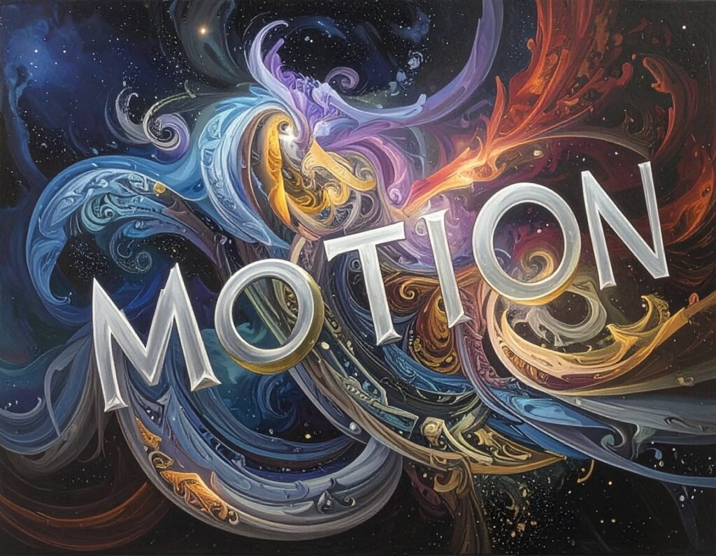
In today’s hyper-fast digital world audiences scroll, skip, and swipe in seconds. Static words, no matter how well-written, often get lost in the blur of endless feeds. But give those same words movement—make them stretch, spin, dissolve, or bounce—and suddenly, they demand attention.
That’s the magic of motion typography (also called kinetic typography). It’s more than flashy visuals; it’s a storytelling technique that turns information into experience, making messages feel alive, emotional, and unforgettable. It bridges design and psychology to ensure that words don’t just appear on a screen—they perform.
Let’s unpack where it came from, why it works, and how creators and brands can harness its full potential.
From Silver Screen to Smartphone: A Brief Evolution
Though it feels like a modern trend born from social media, motion typography’s roots stretch back to mid-20th century cinema. In the 1950s, legendary designer Saul Bass revolutionized film credits by animating text. His work on The Man with the Golden Arm (1955) and Alfred Hitchcock’s North by Northwest (1959) didn’t just list names—they built tension, mood, and anticipation before a single scene unfolded.
Later, films like Catch Me If You Can and series like Mad Men took animated type to new heights, using flowing, stylish typography to transform credits into works of art. These sequences proved that moving text could be just as iconic as moving images.
Fast-forward to today, and the art has exploded beyond movie theaters. TikTok ads, YouTube intros, explainer videos, music promos, and even giant digital billboards in Times Square all use motion typography to grab attention in crowded spaces. Thanks to faster internet, powerful software, and easy-to-use tools, what once required Hollywood-level resources can now be done on a laptop—or even a smartphone.
Motion typography has gone from exclusive cinematic art form to universal digital language. Learn how interactivity boosts engagement in today’s fast-moving digital environments.
Why the Human Brain Loves Moving Text
Here’s the psychology behind its power: humans are wired to notice movement. For our ancestors, spotting a rustle in the bushes could mean survival. That instinct is still deeply embedded in our brains, which is why motion—especially unexpected or rhythmic motion—instantly catches our eyes.
But motion typography goes beyond raw attention-grabbing. It also:
Guides focus → Moving text directs the eye to key points, ensuring the most important words don’t go unnoticed.
Sets the mood → Gentle fades feel calm, sharp cuts feel urgent, and playful bounces spark joy.
Enhances memory → We’re more likely to recall information when it’s experienced as movement and emotion, not just static text.
Creates emotional resonance → A word that slides in smoothly feels different than one that shatters on impact.
In short, moving words don’t just communicate—they perform. They act as visual cues, emotional triggers, and memory anchors all at once—key elements of conversion psychology.
The Many Faces of Motion Typography
The beauty of animated text lies in its versatility. Like a chameleon, it adapts to tone, context, and audience:
Playful & Bold → Bright, bouncy animations are perfect for social ads, meme culture, or youth-focused content. They spark energy and make messages fun.
Sleek & Minimal → Clean lines and subtle transitions give corporate explainers or professional brands a polished, trustworthy edge.
Cinematic & Dramatic → Slow builds, dramatic fades, and moody overlays create atmosphere in movie trailers and TV intros.
Experimental & Artistic → Lyric videos, creative campaigns, or art installations push boundaries with text that morphs, warps, or interacts with visuals.
Brands are already showing how diverse its uses can be:
Apple’s eco-campaign used fast, green-toned typography paired with sketches to spotlight sustainability.
Childline and other nonprofits have leaned on motion text to tell sensitive stories in a way that’s approachable yet impactful.
Music artists increasingly release lyric videos where words pulse and transform in sync with beats, making music both seen and heard.
Motion typography proves that words don’t just tell stories—they can be the story. This storytelling power connects deeply with brand identity and visual storytelling.
Why Businesses and Creators Can’t Ignore It
Motion typography isn’t just design decoration—it’s a strategic communication tool. In fact, it delivers on multiple levels:
Instant engagement → Bold visuals stop the scroll in crowded feeds.
Clarity & focus → Animated highlights make complex ideas or statistics easier to follow.
Emotional connection → Speed, rhythm, and motion style can spark urgency, inspiration, or empathy.
Cross-platform adaptability → Works seamlessly on Instagram reels, websites, presentations, digital ads, and outdoor screens.
Brand reinforcement → Fonts, colors, and movement patterns can be tailored to mirror brand personality, making every animation feel “on brand.”
That’s why scrappy startups and Fortune 500 companies alike rely on it. Whether launching a new product, simplifying a technical concept, or sparking viral engagement, motion typography is now a cornerstone of modern storytelling. Learn how our web design and branding services can integrate motion typography into your digital presence.
Behind the Scenes: How It’s Made
Creating motion typography is equal parts art, design, and technology. Here’s the typical workflow:
Concept & Storyboarding – Map the message and visualize how words will flow across the screen. This step ensures motion serves the narrative, not just aesthetics. Explore more about storyboarding in web design.
Font & Style Choices – Typography carries personality. Serif fonts feel classic, sans-serif feels modern, bold feels urgent, script feels personal. Matching font to mood is critical. Learn about typography design systems.
Animation Design – Software like Adobe After Effects, Cinema 4D, or Linearity Move brings text to life. Movements can be as simple as a fade or as complex as 3D morphing.
Sound Integration – Pairing text with sound effects or music amplifies emotion. A bounce that lands with a bass beat feels alive in a way silent text never could.
Testing & Refinement – Designers adjust pacing, spacing, and readability across devices. A perfect animation on desktop might feel too fast on a phone screen.
The process is much like choreographing dance—every move needs rhythm, intention, and flow.
Pro Tips for Typography That Pops
If you’re experimenting with motion typography, here are golden rules to follow:
Less is more → Short, sharp bursts of text resonate more than paragraphs in motion.
Prioritize readability → Effects should enhance clarity, not make text harder to read. This ties closely with web accessibility best practices.
Match mood to message → A playful bounce won’t suit a somber campaign.
Perfect the timing → Speed should match the rhythm of content. Too fast feels chaotic; too slow drags.
Stay consistent → Fonts, colors, and animation styles should align with your brand identity.
Great motion typography doesn’t scream, “Look at me!”—it whispers, “Here’s how you should feel.”
Where You’ll Spot It Daily
Motion typography isn’t limited to flashy film titles or slick brand campaigns—it’s woven into our everyday digital experience, often without us even noticing. Here’s where it shows up most:
Title sequences in films and series → Those iconic intros aren’t just for mood; they establish identity and tone. Think Stranger Things with its glowing red text, instantly signaling mystery and nostalgia.
Social media ads and shorts → TikTok, Instagram Reels, and YouTube Shorts rely heavily on animated text overlays to grab attention in the first few seconds. Bold captions, bouncing callouts, and kinetic transitions keep audiences hooked.
Marketing campaigns and product launches → Brands use moving words in teasers, promos, and countdowns. Animated slogans or reveal texts can build anticipation and excitement.
Educational explainer videos → Complex ideas become digestible when text highlights key terms, definitions, or steps. Platforms like Khan Academy or corporate training modules often use animated captions for clarity.
Music lyric videos and entertainment promos → From karaoke-style bouncing words to creative typographic storytelling, music videos use motion text to blend rhythm, visuals, and lyrics into one immersive experience.
Presentations and live events → Business pitches, conferences, and even TED Talks use animated titles and slide transitions to make data more engaging and memorable.
Digital billboards and signage → In cities, moving words on LED displays draw more eyes than static posters. They’re dynamic, adaptable, and perfect for time-sensitive messages.
Mobile apps and UI design → Subtle animated text in onboarding screens, notifications, or loading sequences adds polish and keeps users engaged during “downtime.”
Gaming and esports → From countdown timers to in-game instructions and cinematic intros, motion typography adds drama and energy to the gaming experience.
In short, motion typography is everywhere—seamlessly blending into the media we consume, the apps we use, and the spaces we move through. Once you notice it, you’ll realize just how much of your daily digital life is powered by moving words and design systems.
The Future: Smarter, Faster, More Interactive
Motion typography is already mainstream—but the future is even bigger. Here’s what’s next:
AI-powered personalization → Imagine words that adjust speed, style, or effects based on each viewer’s preferences or behavior.
Interactivity → In AR and VR, animated text may float around users, respond to gestures, or adapt to environment.
3D typography → Emerging tools will let words leap out of screens, perfect for immersive campaigns.
Accessibility integration → Motion text could evolve to support language learning or assistive technologies, making communication more inclusive.
With TikTok, Instagram Reels, and YouTube Shorts shaping global consumption habits, motion typography is no longer a nice-to-have. It’s quickly becoming the backbone of digital storytelling. Learn more about mobile-first design trends shaping that future.
Final Takeaway
Words on their own may inform—but words in motion inspire. Motion typography lives at the intersection of design, psychology, and storytelling. It transforms simple text into immersive experiences that people notice, feel, and remember.
Whether you’re pitching a product, raising awareness for a cause, or simply trying to stand out in a crowded feed, animated text ensures your message doesn’t just appear on a screen—it lingers in memory. For help implementing dynamic visuals and digital marketing strategies, partner with experts who understand how to make design move.
So the next time you want your audience to stop scrolling? Don’t just write your message. Make it move.