When you think of the world’s most iconic brands—Starbucks, McDonald’s, Apple—one thing immediately comes to mind: their colors. Colors aren’t just decoration; they’re identity, psychology, and strategy wrapped into one. On a website, the right palette doesn’t just make things look “pretty”—it drives attention, builds trust, sparks emotions, and helps people navigate with ease.
But with millions of colors and endless combinations, how do you pick the right ones? This guide walks you through everything: the psychology of colors, the types of palettes, step-by-step frameworks, and the best tools to help you craft a scheme that looks great and works hard for your brand. You can also explore our web design services for professional help creating visually cohesive digital experiences.
Why Website Colors Matter More Than You Think
1. They Shape First Impressions
Studies show that people form an opinion about a website within seconds, and color is the first thing they notice. Get it right, and visitors feel engaged. Get it wrong, and they’ll bounce. Learn more about how web design shapes brand perception.
2. They Build Brand Recognition
Think “red and white” and Coca-Cola comes to mind. Colors, when used consistently across a website and marketing touchpoints, become shorthand for your brand identity. In fact, research suggests 85% of shoppers base purchasing decisions on color alone. Consistency is a key principle in building a powerful brand identity.
3. They Guide User Behavior
Colors aren’t just visual—they’re directional. A bold accent color on a CTA button can push users toward conversion. A soft neutral background can make product images pop. With the right contrasts, you can draw the eye exactly where you want it. For more on color’s role in engagement, check out the power of color in web design.
4. They Create Emotional Connections
Every color carries meaning. Red conveys urgency, yellow sparks happiness, blue inspires trust, and green whispers growth. The palette you choose sets the emotional tone of your brand.
5. They Ensure Accessibility & Usability
A good palette isn’t just about beauty—it’s about inclusivity. Without enough contrast, people with visual impairments or color blindness may struggle to read or navigate your site. Smart color choices ensure your brand is welcoming to everyone. Learn how web accessibility benefits all users, not just some.
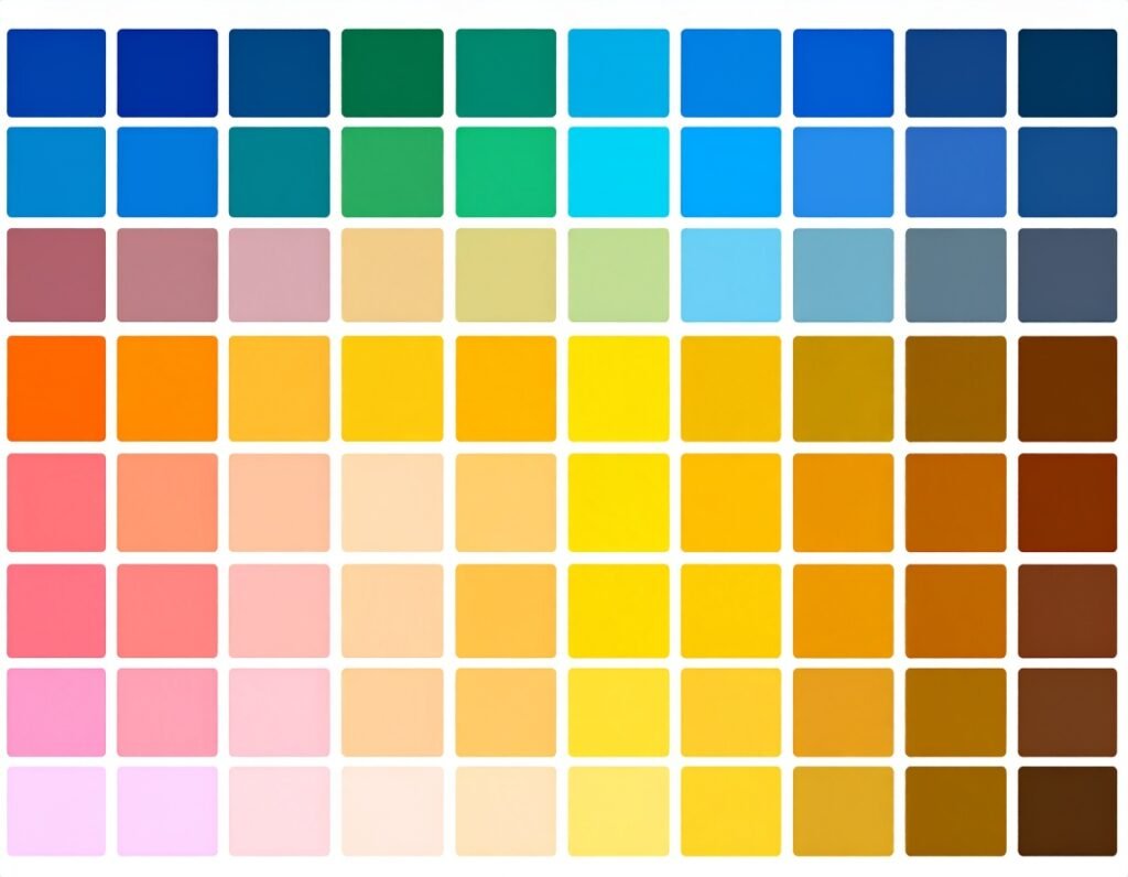
Understanding Color Theory (Without the Overwhelm)
Before you dive into palettes, you need to understand the basics of color theory—the “rules” of how colors interact. Explore more about choosing the perfect color scheme for your website.
The Color Wheel: A circular map showing primary, secondary, and tertiary colors. It’s the foundation of all palette-making.
Hue: The pure base color (red, blue, green).
Shade: Hue + black (darker).
Tint: Hue + white (lighter).
Tone: Hue + gray (softer variation).
Contrast: How much two colors stand apart from each other.
With this language, you can move from vague requests like “make it less bright” to precise tweaks like “reduce saturation by 20%.”
The Six Main Types of Color Schemes
Different palettes tell different stories. Here are the most popular frameworks used in web design and branding:
Monochromatic – Variations of one hue. Clean, elegant, minimal. Great for sophistication, but can lack contrast.
Analogous – Neighboring colors on the wheel (e.g., green, teal, blue). Creates harmony and flow, but not much “pop.”
Complementary – Opposite colors (e.g., orange + blue). High contrast, bold, and eye-catching. Perfect for CTAs.
Split Complementary – One base color + the two on either side of its opposite. Strikes a balance between harmony and contrast.
Triadic – Three evenly spaced colors (e.g., red, yellow, blue). Energetic, vibrant, and balanced.
Tetradic – Two pairs of complements (e.g., blue + orange + green + red). Versatile and rich, but harder to balance.
A Step-by-Step Framework to Choose Your Website Colors
Step 1: Define Your Brand and Audience
Ask: What do we want to stand for? How do we want people to feel? Learn how UX research can guide these choices.
A financial advisor may want trust and stability → blues and neutrals.
A kids’ toy company may want fun and excitement → bold primaries.
Step 2: Gather Inspiration
Look at competitors, industries, and even nature. Save palettes that catch your eye. Tools like Pinterest, Behance, or even product packaging can spark ideas.
Step 3: Pick Your Palette Type
Choose one of the six schemes above that fits your brand personality. A minimalist tech startup may prefer monochrome, while a festival brand may lean toward triadic vibrancy.
Step 4: Choose Dominant, Secondary & Accent Colors
Apply the 60-30-10 rule:
60% dominant color: Your main vibe (background, large areas).
30% secondary: Adds depth (headers, sidebars, icons).
10% accent: Draws attention (buttons, CTAs, highlights). Discover more about micro-interactions that guide user attention effectively.
Step 5: Check Accessibility & Contrast
Use tools like Color Safe or WebAIM Contrast Checker to ensure legibility for all users. If text blends into the background, adjust shades until it passes WCAG guidelines. Learn how cross-device consistency supports accessibility.
Step 6: Test in the Real World
Preview your palette on multiple devices: desktop, mobile, and tablet. Test it with real users. Does the CTA button pop? Is the text easy to read? Does it “feel” like your brand? Iterate until it clicks.
The Psychology of Color in Branding
Here’s a quick cheat sheet of common associations:
Red: Energy, urgency, passion (Coca-Cola, YouTube).
Blue: Trust, stability, calm (Facebook, PayPal).
Yellow: Optimism, youth, warmth (McDonald’s).
Green: Growth, health, balance (Spotify, Whole Foods).
Orange: Creativity, friendliness, affordability (Fanta, Nickelodeon).
Purple: Luxury, wisdom, imagination (Cadbury, Twitch).
Black: Power, elegance, sophistication (Apple, Chanel).
White: Simplicity, clarity, purity (minimalist brands).
Brown: Earthiness, honesty, grounded (Timberland).
Silver/Gray: Modern, tech, futuristic (Tesla, Sony).
Pro Tip: Cultural differences matter. White = purity in the West, mourning in some Eastern traditions. Always consider your audience. For more on brand storytelling through visuals, explore visual storytelling.
Pro Tips for Picking the Right Palette
Start with emotion, not aesthetics. Ask what you want users to feel.
Less is more. Stick to 2–4 core colors, avoid rainbow overload.
Use neutrals strategically. White, gray, or beige can balance bolder tones.
Consistency is key. Use the same palette across your website, logo, and marketing for maximum recognition. Explore design systems that help maintain visual consistency.
Evolve with your brand. Don’t be afraid to refresh as trends and audiences shift. Learn when it’s time for a website redesign.
The Best Tools for Building Your Palette
Here are some popular (and free!) tools to help you experiment:
Adobe Color – Interactive color wheel + trend libraries.
Coolors – Generate palettes or pull them from photos.
Paletton – Visualize how palettes will look on websites.
HueSnap – Create and share palettes across devices.
Palettr – Build palettes based on keywords and themes.
Canva Palette Generator – Upload an image, get instant palettes.
Khroma – AI-driven palette suggestions based on your preferences.
Color Safe – Generate WCAG-compliant, accessible palettes.
FAQs: Common Color Questions in Web Design
Q: What’s a hex code, and why does it matter?
A hex code is a six-digit number that identifies an exact color. It ensures consistency across devices and platforms.
Q: How do I pick eye-catching colors?
Focus on contrast. Bright accents (like orange or red) paired with calmer neutrals usually work best.
Q: How do I make sure text stays readable?
Always test dark text on light backgrounds—or light on dark. Check contrast ratios.
Q: What if I want a minimalist site?
Use neutrals (white, black, gray) with one or two bold accents. Clean and modern. View our portfolio for minimalist inspiration.
Final Thoughts: Color as Strategy, Not Decoration
Choosing colors for your website isn’t about personal preference—it’s about psychology, usability, and storytelling. A great palette does three things:
Reflects your brand identity.
Guides users toward action.
Builds recognition and trust.
Think of colors as silent messengers. When chosen intentionally, they don’t just make your website look beautiful—they make it unforgettable. If you’re ready to elevate your digital presence, explore our web development and content creation services.