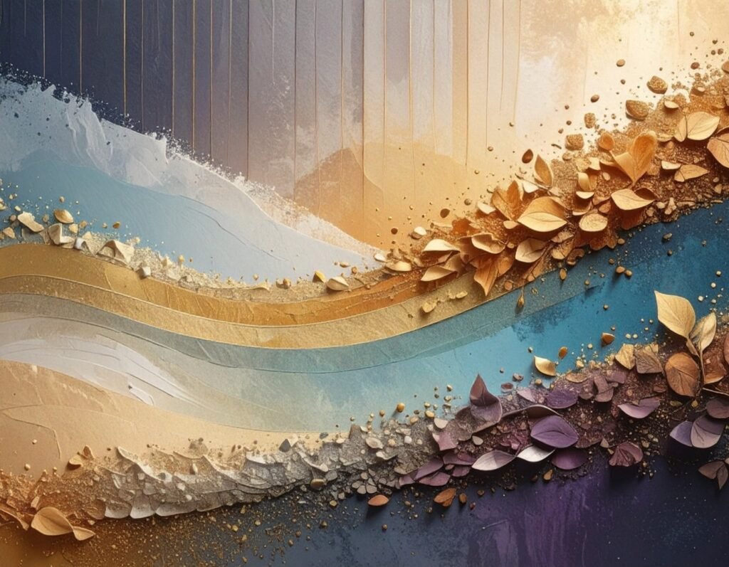
When we think about design today—whether it’s a cutting-edge website, a striking logo, or a brand’s visual identity—the conversations usually center on color theory, typography, layout, or performance. But there’s an unsung hero working quietly behind the scenes: texture.
Texture is more than surface decoration. It’s a design language of its own—one that communicates touch, memory, and emotion through sight alone. In a world where digital experiences often feel sterile, texture reconnects us with something profoundly human: our sense of touch.
Design luminary Don Norman, author of The Design of Everyday Things, argues that products succeed not just because they function well, but because they resonate emotionally. Texture is one of the most direct pathways to that resonance. It transforms the intangible glow of a screen or the flatness of a print into an experience that feels alive.
Let’s dive into why texture matters, where it belongs, and how the world’s best brands use it to tell unforgettable stories.
Why Texture Matters: More Than Meets the Eye
1. It Engages Our Senses
Flat designs can be efficient, but they risk being forgettable. Humans are wired to notice patterns and surfaces; a slight paper grain or a concrete crack immediately invites exploration. Edward Tufte, in Envisioning Information, describes how layered visual complexity increases comprehension and retention. Texture leverages this same principle: it transforms a quick glance into a longer look—much like UX design that engages both mind and emotion.
2. It Creates Realism in Digital Spaces
Screens are inherently intangible. Texture bridges the digital and physical by evoking the sense of touch. Think of Apple’s early iOS apps—leather-bound calendars, paper notepads—where skeuomorphism wasn’t just a style but a comfort tool. While skeuomorphism faded, its lesson remains: texture humanizes technology, much like cross-device consistency makes experiences feel more natural and connected.
3. It Expresses Brand Personality
Every brand has a “feel.” Marty Neumeier reminds us in The Brand Gap that branding is about managing perception. Texture translates those perceptions visually. A craft beer brand might use chalkboard and wood textures to signal community and tradition, while a fintech startup may choose sleek gradients and glass-like surfaces to communicate trust and precision—just as described in building a powerful brand identity.
4. It Enhances Usability and Accessibility
Texture isn’t just eye candy—it can serve function. Subtle contrasts between textured and flat areas can help users identify sections of a page, much like tactile dots on an ATM keypad. When designed thoughtfully, texture adds both beauty and clarity, contributing to web accessibility and inclusive design.
The Many Faces of Texture
Natural Textures: Borrowing from the Earth
Wood Grain: Suggests authenticity, craftsmanship, warmth.
Stone or Concrete: Conveys stability, durability, permanence.
Fabric or Fibers: Adds comfort, familiarity, softness.
Paper: Signals simplicity, sustainability, or creativity.
Eco-conscious brands like Patagonia or Whole Foods lean heavily on natural textures to reinforce values of sustainability and organic living—an approach similar to brands featured in our portfolio of sustainable and ethical designs.
Artificial and Digital Textures: Crafted Surfaces
Metallics and Foils: Communicate luxury, modernity.
Concrete or Plastic Patterns: Evoke urban, industrial vibes.
3D Digital Grids and Renders: Perfect for futuristic or tech-driven brands.
Jaguar, for example, often showcases its logo against brushed metal or leather textures, aligning with its luxury automotive DNA—much like how motion graphics can amplify a brand’s tone in digital environments.
Tactile Textures: The Power of Touch in Print
Embossing, Debossing, Letterpress: Add a physical layer of interaction.
Matte vs. Gloss Finishes: Create contrasts in feel as much as sight.
Apple’s unboxing experience is iconic because of this. The matte white box with its subtle glossy emblem creates a multisensory ritual that feels premium before you even touch the product inside.
Textured Typography and Fonts
Typography doesn’t need to be flat. Textured fonts—splattered, metallic, distressed—turn words into art. Coca-Cola frequently uses nostalgic textured scripts to evoke heritage. Independent designers often experiment with grunge fonts for posters, album covers, or festival branding—an idea echoed in our insights on typography and design systems.
Photography as Texture
Close-up photography of denim, cracked earth, or brushstrokes can function as texture in itself. Fashion brands often use fabric photography as textured backdrops, blurring the line between product and design.
Where Texture Belongs in Modern Design
In Web Design
Backgrounds: A faint canvas grain or soft gradient can replace sterile emptiness.
Hero Sections: The opening banner of a site is prime real estate—bold wood, fabric, or metal textures here can instantly communicate brand tone. Learn more about impactful web design and branding approaches.
Navigation and Menus: Brushstroke highlights or textured dividers can make exploring more intuitive and memorable.
Content Blocks: A torn-paper sidebar or a textured callout box adds hierarchy and personality, just like the design patterns used in modern design systems.
In Branding and Graphics
Logos: Textured versions of logos on business cards or packaging can elevate meaning—metallic embossing for luxury, rough-printed ink for craft authenticity.
Print Design: From posters to stationery, paper stock and finishes act as silent brand ambassadors.
Campaigns: Social or cause-driven campaigns often use bold textures (cracked earth for climate change, blurred imagery for mental health awareness) to evoke empathy—similar to the storytelling seen in infographic design.
Modern Trends in Textured Design
Subtle Gradients and Blends
Instead of heavy skeuomorphism, modern design uses smooth gradients to suggest depth. Spotify’s vibrant shifting gradients are a masterclass in energy without clutter—mirroring the layered appeal discussed in world-class web design.Immersive 3D Textures
With WebGL and AR technologies, designers now simulate moving water, fabric folds, or rippling surfaces. Gaming and fashion brands are especially keen on this.Minimalist Noise and Grain
Adding tiny grain overlays prevents designs from looking overly sterile. Many SaaS products now incorporate this trend for a warmer, more human aesthetic.Eco and Organic Vibes
Sustainability is shaping aesthetics. Starbucks often uses recycled-paper backgrounds, chalk textures, and wooden tones to reinforce ethical values—echoing the principles of ethical design we explore in our web design services.
Tools and Techniques for Creating Textures
Stock Libraries: Platforms like Texture King or Lost and Taken provide high-quality surfaces.
Photoshop & Illustrator: Noise filters, brushes, and pattern generators help create custom textures.
Procreate Packs: Quick-grunge or watercolor effects for illustrators and digital artists.
Scanning Real Objects: Wrinkled paper, painted walls, fabrics—digitized for authenticity no software can replicate.
Code-Based Textures: CSS gradients, SVG noise, or WebGL for lightweight and scalable textured effects—similar to the dynamic patterns used in interactive web experiences.
Best Practices: Texture Without Overwhelm
Choose With Intention: Every texture should tie back to brand personality.
Don’t Overload: One or two textures per design are enough—too many feels chaotic.
Prioritize Legibility: Always test text against textured backgrounds. Use overlays or fades when needed—best practices found in our navigation design guide.
Stay Consistent: A rustic paper texture may suit an artisanal bakery, but it would clash on a sleek fintech platform.
Optimize for Performance: Compress images, use modern formats like WebP, and test load speeds.
Accessibility Comes First: Ensure texture doesn’t compromise color contrast or usability for low-vision users—key in UX research and accessibility-driven design.
Real-World Examples
Nike: Uses gritty asphalt and graffiti textures in campaigns to connect with urban sports culture.
Airbnb: Relies on soft gradients and organic visuals to foster warmth and belonging.
Craft Breweries: From chalkboards to wooden barrels, their branding leans into community textures.
Jaguar: Leather and metallic textures emphasize its luxury heritage.
Foreign Policy Studio: Customizes paper textures in client stationery—rough for industrial, smooth for premium.
The Psychology of Texture
Ellen Lupton, in Thinking with Type, explains that our brains process visual textures as if they were tactile. This makes texture one of the most direct bridges between perception and memory—similar to the emotional connection discussed in conversion psychology.
David Airey, in Logo Design Love, frames logos as vessels of meaning. Texture helps fill that vessel—transforming a flat mark into something resonant with culture, heritage, and emotion.
Don Norman’s emotional design framework also fits here: functional design may serve, but emotional design delights. Texture is one of the fastest ways to create delight, by reminding users of the physical world.
Final Takeaway: Designing for the Feel of It
Texture is not just “nice to have.” It’s a powerful design tool that:
Adds depth and dimension.
Creates authenticity and realism.
Reinforces brand personality.
Enhances usability and accessibility.
Builds emotional memory.
Steven Heller, the renowned design critic, once wrote: “Design is about making the invisible visible.” Texture is one of the clearest ways to achieve this—by taking feelings and sensations we can’t touch and making them visually tangible.
So the next time you design a logo, a website, or even a simple social media post, don’t stop at asking: What should this look like? Instead, ask: What should this feel like?
That shift in thinking is where design moves from functional to unforgettable.


