The Invisible Persuader: Why Color Rules First Impressions
The Silent Language of Design
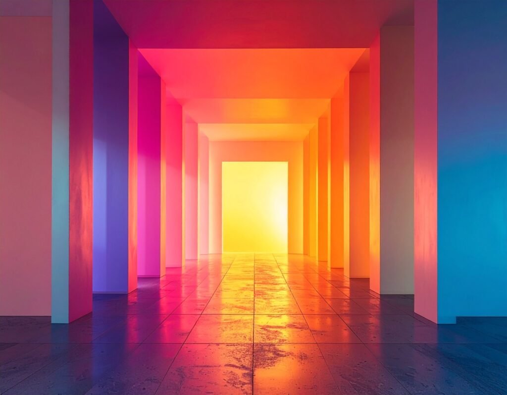
Before a visitor reads a headline, scrolls a page, or clicks a button, color has already spoken. It whispers emotion, sets the mood, and quietly guides the eyes. In web design, color is not decoration — it’s the invisible persuader that shapes trust, sparks curiosity, and influences whether a user stays or leaves.
More Than Aesthetic Appeal
When chosen deliberately, colors help users navigate content, highlight key actions, and reinforce brand character. Poorly chosen colors, on the other hand, create confusion or even repel an audience. Designers who treat color as a strategic tool rather than an afterthought gain a subtle but powerful advantage.
A Secret Sauce That Moves People
Psychologists studying human perception have shown that color shapes not only how we feel but also how we think and behave. A shift in shade can inspire confidence, urgency, or calm. This is why businesses that understand the emotional and cognitive pull of color often outperform those that rely on guesswork.
What You’ll Learn Here
In this article, we’ll explore how color influences psychology, brand identity, accessibility, and conversions. You’ll see how leading companies leverage color to move people, and you’ll discover practical frameworks you can apply immediately. By the end, you’ll know how to transform color from a design choice into a business advantage.
The Building Blocks of Color in Digital Design
Understanding the Core Properties
Every color on screen is defined by three qualities:
Hue: the family name we give a color — red, blue, green, and so on.
Value (lightness): how bright or dark a hue appears.
Saturation: the intensity, ranging from muted pastels to bold neon.
These three elements combine to give color its character. Designers also often categorize colors as warm (reds, oranges, yellows), which energize and stimulate, or cool (blues, greens, purples), which calm and reassure.
Finding Harmony in Contrast
Colors rarely live alone. They gain meaning and beauty in relationship to others. That’s where harmony systems come in:
Analogous palettes (neighboring hues on the wheel) feel smooth and cohesive.
Complementary palettes (opposites on the wheel) provide striking contrast.
Triadic palettes (three evenly spaced hues) strike a balance between variety and unity.
Each scheme serves a different purpose — cohesion, drama, or versatility.
Color Is Always Contextual
The artist Josef Albers famously showed that a single color can appear completely different depending on its surroundings. A medium gray may look light against black, but dark against white. This relativity is critical in web design: a button that feels bold on a neutral background may vanish when placed over a photograph. Always test your choices in real-world contexts — with overlays, hover states, and dark mode — not just as isolated swatches.
Creating Order with Tokens
Modern design systems rely on semantic color tokens — names like --primary, --secondary, --accent, or --surface. Instead of hardcoding hex codes, tokens allow colors to adapt consistently across modes, components, and platforms. This keeps your palette flexible while preserving brand consistency everywhere it appears.
The Psychology of Color: How Shades Shape Behavior
Emotional Pull of Warm and Cool Tones
Colors don’t just fill space — they stir feelings. Warm tones like red, orange, and yellow often signal urgency, passion, or optimism. A red “Buy Now” button, for example, demands attention and sparks action. Cool tones like blue, green, and purple create the opposite effect: blue suggests trust and calm, green evokes health or growth, and purple carries connotations of creativity and luxury. These associations help designers set the emotional stage before a single word is read.
The Nuance Behind Universal Claims
While these tendencies hold true in many cases, color psychology is not a set of fixed rules. Context matters. Red may mean danger in Western cultures but prosperity in parts of Asia. A vibrant accent may energize one interface but feel overwhelming in another. Even surrounding colors can change how a single hue is perceived — what looks bold in one setting may fade in another.
What Research Really Shows
Decades of psychological studies confirm that color can influence mood, cognition, and behavior. It can motivate, soothe, or unsettle — but always conditionally. The same blue that calms users on a banking site may feel lifeless on a social platform. This variability is why designers must resist the myth of universal color rules.
Test, Don’t Assume
The most reliable way to use color is to treat psychological insights as starting hypotheses, not final answers. Pair theory with user testing to discover what truly resonates with your audience. By combining evidence with real-world feedback, you can ensure your palette isn’t just theoretically powerful but practically effective.
Color and Brand: Identity in a Single Glance
When Color Speaks for a Brand
Some brands need no introduction — their colors do the talking. Tiffany’s robin egg blue signals timeless elegance long before you see the logo. Coca-Cola’s iconic red, chosen over a century ago, conveys energy, joy, and instant recognition worldwide. A single swatch can serve as a company’s emotional fingerprint.
Aligning Color with Personality
The key is alignment. A brand that thrives on trust — such as a financial institution — often leans on calm blues. A startup selling eco-friendly products naturally gravitates toward greens to reinforce sustainability. Luxury houses favor purples, blacks, or golds to project exclusivity, while entertainment brands like Netflix employ bold reds to stir urgency and passion. Choosing a palette is less about taste and more about reflecting the values and emotions you want audiences to associate with your name.
A Process That Creates Consistency
Building a strong brand palette follows a simple but disciplined path:
Audit the brand: define core values and study competitor colors.
Create mood boards to capture emotional direction.
Apply the 60/30/10 principle: 60% dominant color, 30% secondary, 10% accent for balance and hierarchy.
Translate choices into semantic tokens (
--primary,--accent,--surface) for technical consistency.Roll out the palette across all touchpoints — digital, print, packaging, even physical spaces.
Examples in Practice
Apple’s restrained whites and grays, Spotify’s signature green enhanced by dynamic album tones, and Netflix’s striking red against dark gray all show how color, thoughtfully applied, becomes shorthand for brand identity.
Accessibility and Inclusivity: The Non-Negotiable Guardrails
Why Contrast Is Critical
Accessibility is not a design bonus — it’s a baseline requirement. The Web Content Accessibility Guidelines (WCAG) set clear standards: body text must meet a contrast ratio of at least 4.5:1, while larger text requires a minimum of 3:1. These ratios ensure legibility for people with visual impairments, older users, and anyone viewing screens in challenging environments. Ignoring contrast doesn’t just frustrate users — it also exposes brands to reputational and even legal risks.
Tools That Make It Easier
Designers don’t need to calculate ratios by hand. Simple contrast checkers can flag weak combinations instantly, while modern design systems can automate compliance by embedding contrast rules into color tokens. With this approach, every button, link, and heading inherits accessibility by default.
Beyond Color Alone
Accessibility isn’t only about ratios. Interfaces must avoid relying on color alone to convey meaning. A red error state, for example, should also include an icon or label. Charts should pair colors with patterns or symbols so color-blind users can still interpret the data.
A Practical Checklist
Run contrast checks for all text and interactive elements.
Test with a color-blind simulator to spot hidden issues.
Use redundant cues: icons, labels, and patterns alongside color.
Conduct usability sessions with people who have disabilities to validate real-world effectiveness.
By building inclusivity into color decisions, designers ensure digital products work not just for most users — but for all users.
Color for Conversion: Rules, Myths, and Testing
Busting the “Best Color” Myth
One of the most persistent myths in digital marketing is the idea of a universally “best” call-to-action (CTA) color. In reality, there is no magic button hue that guarantees conversions. A red CTA might outperform green on one site, but flop on another. What truly drives performance is contrast, novelty, and context — how the button stands out within the overall palette and whether it fits the brand’s visual language.
Designing Experiments That Work
Instead of relying on guesswork, treat color decisions like any other optimization challenge: test them. A solid experiment template includes:
Hypothesis: “A high-contrast accent button will increase click-through rates.”
Segments: Define which user group you’re measuring (new visitors, mobile users, returning customers).
Variants: Compare current button color versus a high-contrast alternative, possibly adjusting placement as well.
Sample size: Ensure enough users are included to produce statistically valid results.
KPIs: Track micro-conversions first, like clicks or form starts, before attributing changes to revenue shifts.
Quick Wins for Better CTAs
You don’t need to overhaul your design to see results. Some reliable tactics include:
Boosting contrast between the CTA and its background.
Avoiding colors already heavily used in the surrounding layout.
Balancing brand consistency with enough novelty to draw the eye.
Validate With Visual Data
Finally, pair A/B testing with heatmaps and click maps. These tools reveal whether users are noticing and interacting with your CTAs. If attention isn’t shifting, changing the color alone won’t fix the problem.
When guided by evidence rather than myths, color becomes a measurable driver of conversions rather than a gamble.
Practical Palette Systems and Workflows That Scale
The 60/30/10 Balance
An effective palette isn’t just about which colors you pick, but how you distribute them. A reliable framework is the 60/30/10 rule:
60% dominant neutral (backgrounds, large surfaces)
30% secondary (navigation, supporting sections)
10% accent (calls-to-action, highlights)
This balance creates visual hierarchy while preventing overwhelming complexity.
Naming Colors With Tokens
Instead of hardcoding hex codes everywhere, define semantic tokens that describe purpose, not appearance. A simple set might look like this:
--bg: #F9FAFB--surface: #FFFFFF--text: #111827--accent-primary: #2563EB--accent-secondary: #F59E0B--danger: #DC2626
This approach makes palettes easier to scale, update, and adapt across devices.
Designing for Variants
A robust system anticipates different states and environments. Plan for light and dark modes, text over image overlays, and interactive states like hover, focus, disabled, and error. These variations prevent accessibility gaps and keep the interface consistent.
Tools That Simplify the Process
Designers can streamline palette creation with tools like Adobe Color or Coolors for generating schemes, contrast checkers like WebAIM, and simulators that reveal how colors appear to people with color blindness.
Smooth Handoff to Developers
For implementation, export tokens as CSS variables, provide storybook examples, and set up automated regression tests to ensure changes don’t break contrast requirements. This workflow keeps design and development aligned and prevents accessibility from being an afterthought.
Trends, Motion, and Personalization in Color
What’s Trending Now
Color trends evolve just like fashion. Right now, bold and vibrant palettes, muted pastels, and Gradient 2.0 (smoother, layered blends) are shaping modern digital design. Dark mode continues to gain traction for both aesthetic and ergonomic reasons, while duotones add expressive depth to imagery. Influencers like Leatrice Eiseman at Pantone highlight how these palettes reflect cultural moods, helping designers align products with the zeitgeist.
Motion as a Signal
Color isn’t static. Micro-animations — such as a button that shifts hue on hover or a subtle gradient transition — draw the eye without shouting. These cues guide attention naturally, but they must be used with care. Overly aggressive motion risks overwhelming users, especially those with motion sensitivity. Subtlety and restraint ensure inclusivity.
The Rise of Personalization
Platforms like Spotify experiment with dynamic palettes that adapt to album artwork, creating a sense of immersion. Done right, personalization makes interfaces feel alive. But safety nets are essential: fallback colors must always meet contrast ratios, and interactive elements need consistent affordances regardless of theme. A system that flexes within guardrails lets personalization shine without compromising usability.
Case Studies and Micro-Examples That Show Color in Action
Apple Health: Motivating With Meaning
Apple Health demonstrates how carefully mapped colors can guide behavior. Green reinforces growth and progress, blue suggests calm and sleep, while red signals urgency in health alerts. Paired with small, consistent CTAs, these hues support motivation without overwhelming users.
Google Analytics: Making Data Legible
Data-heavy dashboards can easily drown users in noise. Google Analytics solves this with a blue primary interface that feels trustworthy and stable, combined with colored trend markers: green for growth, yellow for caution, red for decline. Ample white space ensures these signals remain easy to read at a glance.
Brand-Specific Distinction
Other platforms illustrate how color supports identity while solving functional needs. Airbnb’s warm coral fosters feelings of hospitality and friendliness. Slack’s multicolored logo and accent system convey creativity and collaboration while staying legible across modes. Netflix’s bold red against dark gray backgrounds amplifies urgency and immersion, echoing cinematic drama.
These examples show that effective palettes are never arbitrary. Each choice balances emotion, clarity, and brand alignment, proving that color is not just decoration — it’s strategy made visible.
Measuring Impact and Proving ROI
KPIs That Matter
To understand whether color choices drive outcomes, track both primary and secondary metrics. Core KPIs include click-through rate on the main CTA, conversion rate, time-to-first-action, and abandonment rate. Secondary indicators like hover states, focus events, and micro-engagements reveal early behavioral shifts before revenue is affected.
A Cadence for Testing
A disciplined analytics flow helps separate signal from noise:
Pilot small changes and observe micro-conversions.
Measure performance with sufficient sample size for statistical power.
Expand into full A/B or multivariate tests.
Roll out proven improvements at scale, monitoring by audience segment to catch contextual differences.
Framing the Business Case
Color experiments are relatively low-cost but high-insight. Adjusting a button shade or refining contrast requires minimal development effort, yet the findings can reveal user preferences and behaviors worth far more than the design time invested. Framed this way, color testing becomes not just a creative exercise but a practical ROI driver.
Actionable Color Checklist for Designers and Developers
Pre-Launch Steps
A streamlined, one-page reference ensures consistent, emotionally resonant color usage:
Define Emotional Goals & Audience – Align colors with desired feelings and target users.
Create Mood Boards & 60/30/10 Palette – Establish dominant, secondary, and accent colors for clarity and hierarchy.
Develop Semantic Tokens & Documentation – Standardize usage across components and platforms.
Run Contrast & Color-Blind Checks – Ensure accessibility and legibility for all users.
Propose A/B Tests – Define hypotheses, audience segments, and micro-conversions to validate design choices.
Measure KPIs & Iterate – Track both micro (hover, focus) and macro (conversion, CTR) outcomes, adjusting as needed.
Suggested A/B Test Variants
Control: existing color setup
Accent Swap: test alternative accent colors
Higher Contrast: increase visual separation for CTAs or key elements
Different Placement: reposition critical buttons or indicators to test attention and engagement
This checklist acts as a practical bridge between design intent and measurable performance, keeping projects on track while maximizing emotional and functional impact.
Conclusion & Next Steps
Color is far more than a visual flourish—it’s a strategic asset that informs decisions, persuades users, and drives conversions when applied thoughtfully. By combining evidence-based hypotheses with structured design systems, accessibility best practices, and rigorous measurement, teams can move beyond subjective choices and treat color as a repeatable lever for impact. Thoughtful color use enhances clarity, strengthens brand perception, and shapes user behavior, proving that when approached responsibly, color is not just decoration—it’s a powerful tool for designing meaningful, effective experiences.


