🛠️ Purpose
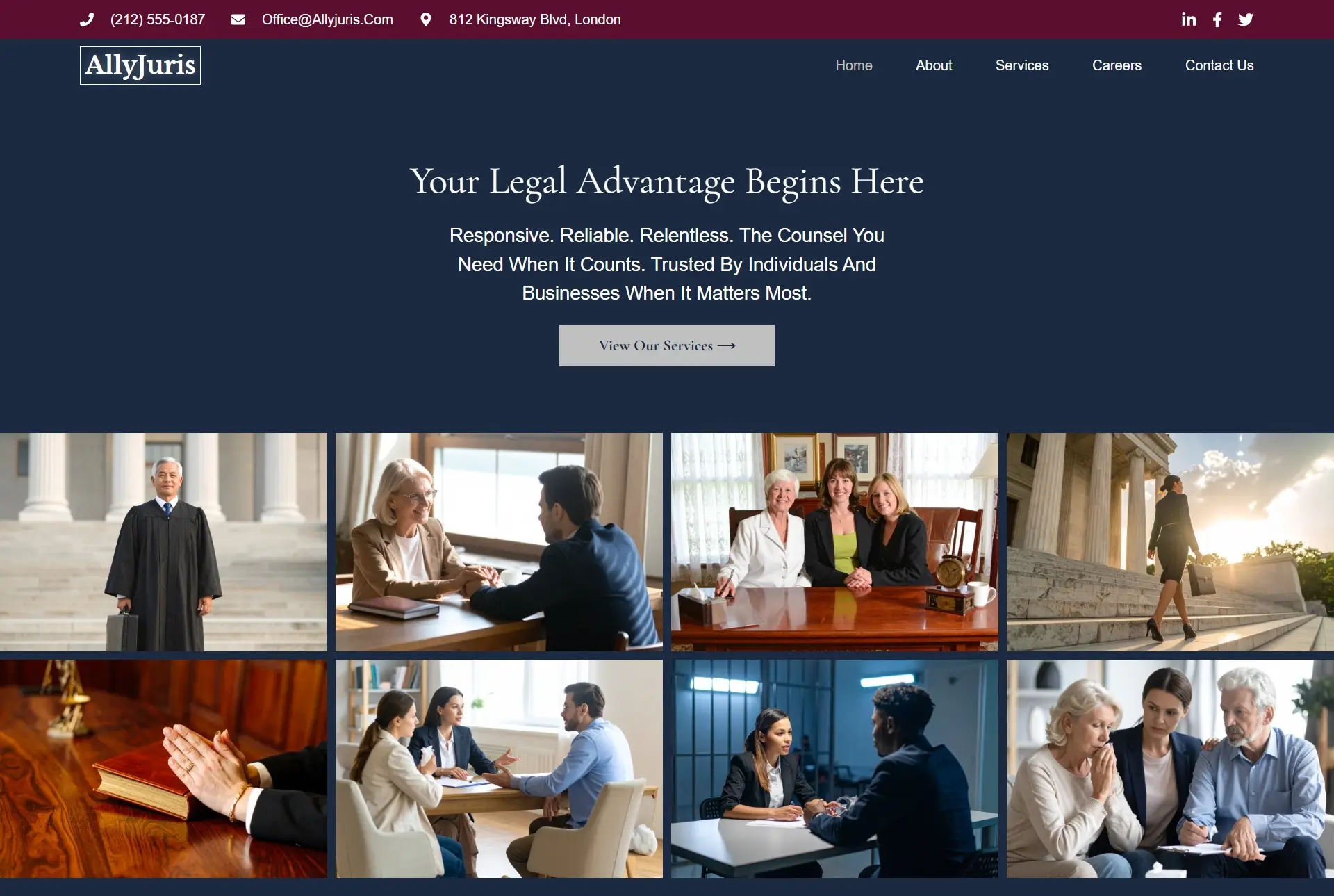
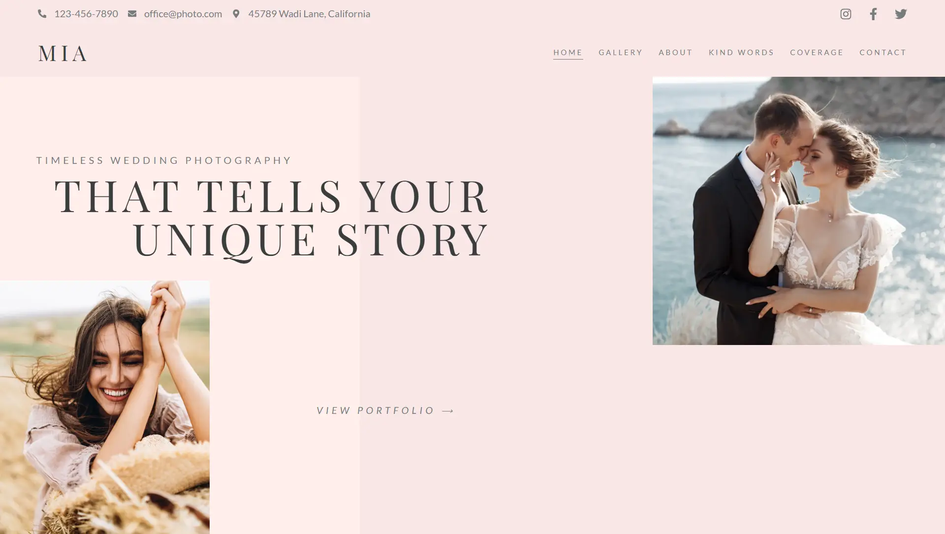
Designed to combine visuals and messaging into one powerful promotional element, the CTA widget lets you build engaging content blocks with a background image, attention-grabbing text, and a clickable button—all in a single component.
🧩 Key Components
Each CTA includes:
Background: Use either an image or gradient to set a visual tone.
Headline: Bold, compelling text to grab attention.
Description: A short supporting line to reinforce the message.
Button: A customizable call-to-action with text, link, and optional icon.
⚙️ Main Configuration Options
Layout
Choose from pre-designed layouts with various text and button positions.
Adjust background settings such as image size, position, overlay color, and hover interaction.
Content
Enter headline text and supporting description.
Define button label, link, icon choice, and icon positioning.
Alignment & Spacing
Align content block (headline, description, button) left, center, or right.
Fine-tune vertical and horizontal alignment, including spacing between individual elements.
🎨 Style Customization
Background Styling: Set color overlays, blend modes, opacity, and hover filters.
Text Style: Control typography (font family, size, weight, letter spacing) and color for headline and description.
Button Style:
Adjust button text color, background, typography, padding, border style, radius, shadow, and hover transitions.
Customize icon appearance, alignment, and spacing from the text.
🛠️ Advanced Controls
Responsive adjustments for text, button, and background settings across desktop, tablet, and mobile.
Margin, padding, z-index, and custom positioning options.
Add entrance animations, scroll or hover effects, and motion transitions.
Include HTML anchor, custom CSS classes, or attributes for deeper customization.
✅ Best Practices
Use engaging backgrounds and contrast-rich text for visual impact.
Keep copy concise and action-focused—clear headlines and descriptions drive engagement.
Style buttons consistently and ensure clickable areas are large enough on mobile.
Use hover overlays or filters to encourage interaction and feedback.
Test responsive layouts thoroughly to maintain balance across devices.
📌 Ideal Use Cases
Landing page hero sections with promotional messaging.
Highlighted sections featuring special offers or services.
Lead generation with clear headlines and clickable call-to-action.
Section banners guiding users to products, guides, contact forms, or sign-up areas.
The Call to Action widget combines aesthetic design with user engagement—allowing you to craft a branded content block that drives clicks and conversions.


