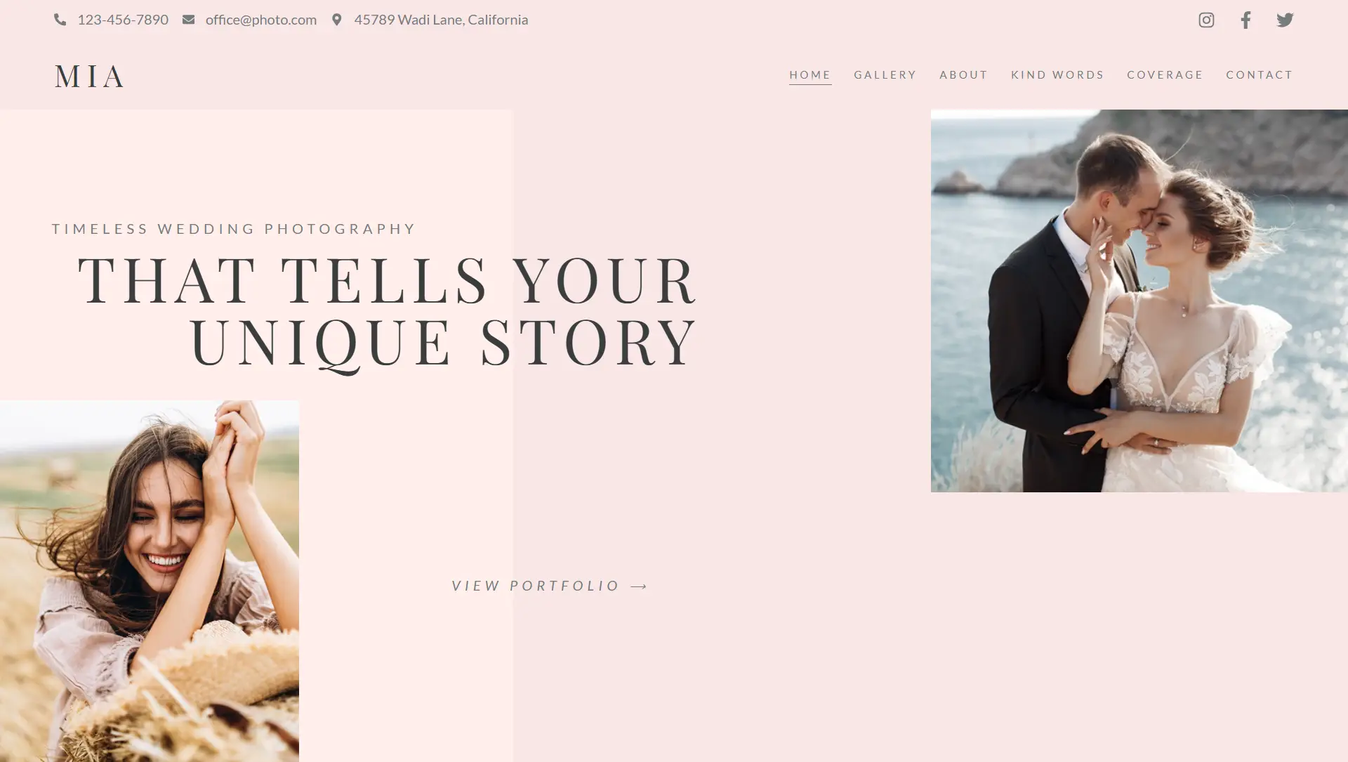
Typography is a key design element that shapes how visitors feel about your content. Along with your color palette, the fonts and text styles you choose help communicate tone—fun, modern, professional, or serious.
Elementor gives you full control over nine core typography settings, allowing you to fine-tune text appearance for any design.
🧩 Typography Settings Overview
Font Family
The typeface used (e.g., Roboto, Lato, Playfair Display)
Previewed directly in the dropdown for easy selection
Defines the personality and readability of your text
Font Size
Controls text size with multiple units:
px(fixed pixels)em(relative to parent element)rem(relative to root element)vw(responsive to screen width)
Adjustable via slider, manual input, or number scrubber
Font Weight
Determines the thickness of characters
Ranges from
100(thin) to900(extra bold)400is standard,700is bold
Text Transform
Instantly changes text case:
uppercase,lowercase, orcapitalize
Useful for headings, buttons, or stylistic emphasis
Font Style
Enables italic, normal, or oblique styling
Oblique works well with some typefaces for a more slanted look
Text Decoration
Adds line effects like:
underline,overline, orline-through
Great for links, highlights, or emphasis
Line Height
Sets vertical spacing between lines of text
Helps improve readability or tighten layouts
Measured in
pxorem
Letter Spacing
Adjusts the space between individual letters
Useful for tightening or expanding word appearance
Measured in
pxorem
Word Spacing
Controls space between entire words
Helps with fine-tuning layout alignment or creating airy designs
Also measured in
pxorem
📝 Quick Tips
Use larger line height for longer text blocks to improve legibility.
Use vw or rem units for better responsiveness across screen sizes.
Adjust letter and word spacing subtly—small changes make a big difference.
Match font family with your brand identity for a more cohesive look.


