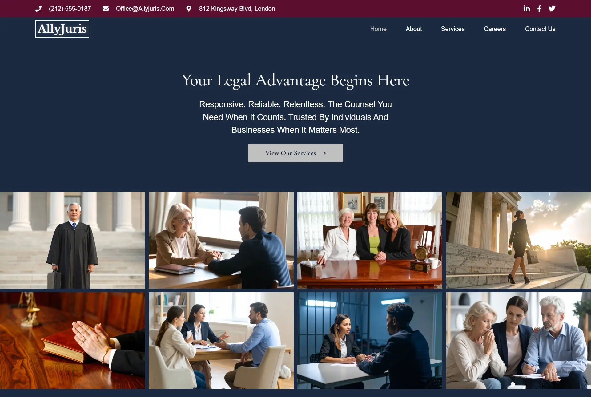
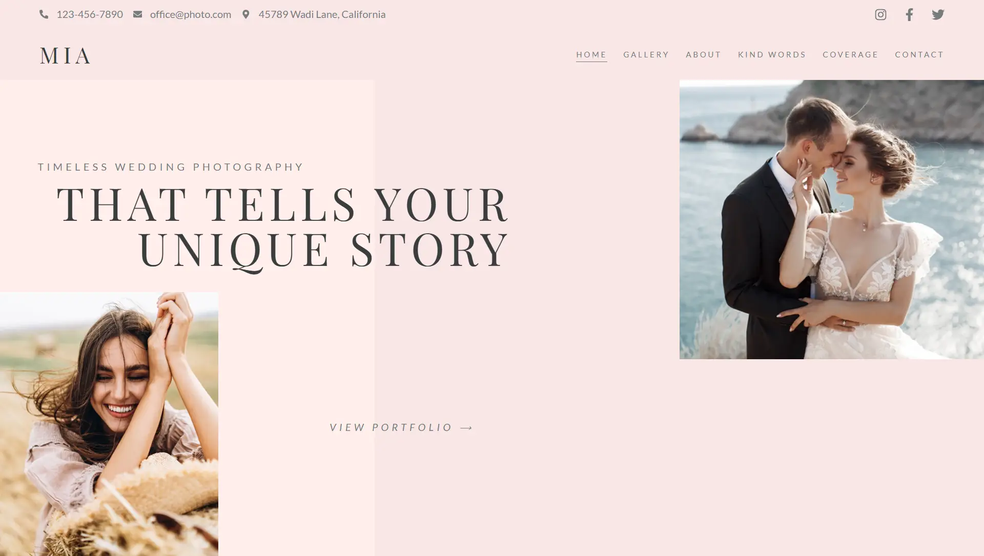
There are four Default Colors: Primary, Secondary, Text, and Accent. The following examples show where they are typically used.
- Primary Colors are used for Headings and Icons.
- Secondary Colors are used for List Items, Subheadings, Animated Headings, and Price Table backgrounds.
- Text Colors are used for Paragraphs and Menu items
- Accent Colors are used for Links, Button backgrounds, Tab and Accordion headings, and Badges
- To use a different color for links other than the accent colors, go to Site settings > Typography > Link
Each of the colors will be used in various widgets in ways similar to the examples above.


