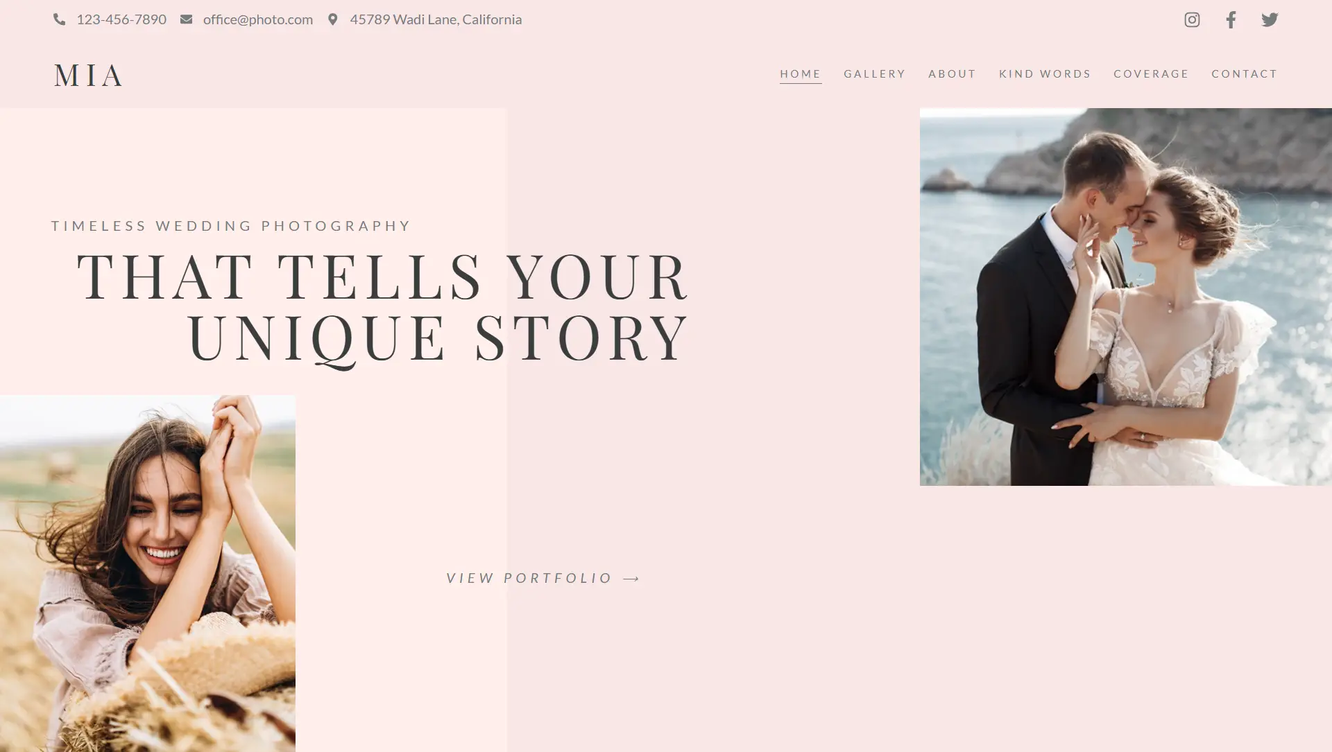
🎯 What It Is
Absolute positioning removes an element from the normal document flow and anchors it relative to its closest positioned ancestor (e.g., a section or column). This gives precise control over placement.
📍 When to Use It
Overlapping elements (e.g., icons on images)
Custom layouts not achievable via standard layouts
Precise control for floating graphics or sticky elements (though caution advised for responsiveness)
⚙️ Step-by-Step Guide
Select the Element
Click the widget, column, or section that needs repositioning and open the Advanced tab.Enable Custom Positioning
Expand the positioning section and switch from “Static” to Absolute (you may need to click the pencil icon).Drag or Define Location
Drag the element visually to reposition it.
Or manually input Horizontal and Vertical Offsets in px, %, vw, or vh for more accuracy
Set Orientation Reference
Choose whether offsets are measured from the start or end edges (Start/End):Horizontal: Left or Right alignment
Vertical: Top or Bottom alignment
📊 Responsive Settings
Absolute settings can be configured individually for Desktop, Tablet, and Mobile to maintain layout responsiveness.
✅ Best Practices
Minimize use: Overuse can cause layout issues on different devices.
Orientation matters: For consistent positioning, anchor offsets relative to the correct side.
Check responsiveness: Always test and adjust in responsive views.
Avoid % in collapsed containers: Numeric px values are more reliable in fluid contexts.
Use sparingly: Better suited for small overlaps or decorative placement, not full-page layout structure.
⚠️ Tips & Insights
When positioned, the element’s width is initially constrained by its container—visible in live positioning.
Dragging around may move an element outside its container; adjust orientation if needed.
Fixed positioning is similar but anchors elements to the viewport, not containers. Absolute elements, in contrast, move with page content.
In summary, the absolute positioning feature in Elementor grants precise control when you need to layer or float specific elements. Use it wisely, with clear orientation choices and responsive adjustments to maintain design integrity across devices.


