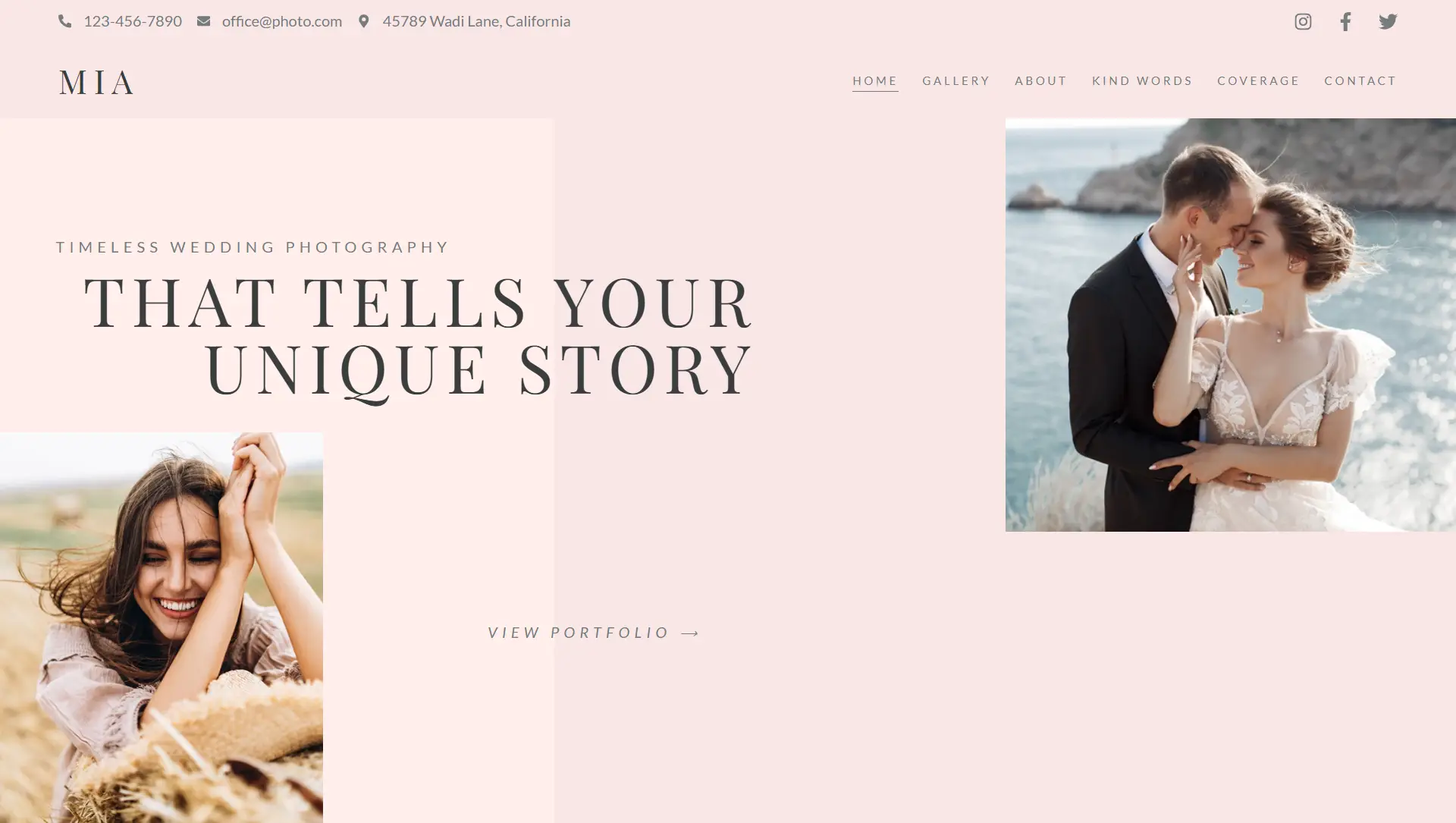
🎯 Purpose
The Basic Gallery widget allows you to display collections of images in a customizable, grid-style gallery—ideal for showcasing photos elegantly without requiring any coding.
⚙️ Content & Configuration
Add Images
Insert multiple images via the Select Images interface. You can add captions when arranging your gallery.Gallery Options
Image Size: Choose thumbnail, medium, full, or define a custom size.
Columns: Set the number of images per row (1–10).
Link Behavior: Link images to their media file, attachment page, or leave unlinked.
Lightbox Support: Enable lightbox display for enlarged image viewing (works only if linking to media files).
Order Settings: Display images in their original order or randomized order for variety.
🎨 Styling & Layout Controls
Image Display
Spacing Between Images: Adjust the gap between images using preset or custom values.
Borders & Corners: Add border styles (solid, dashed, etc.) and define border radius for rounded corners.
Captions
Display Options: Toggle caption visibility.
Alignment & Typography: Control caption alignment, font settings, color, and spacing.
Decoration: Apply text shadows for emphasis.
🛠️ Advanced Layout Tools
Use the Advanced tab to fine-tune:
Placement via margin, padding, positioning, and z-index.
Entrance animations or scroll effects.
Custom CSS classes, HTML attributes, and responsive visibility.
✅ Best Practices
Choose appropriate image sizes to balance clarity and loading time.
Maintain consistent column count and spacing for a clean gallery layout.
Enable lightbox for improved viewing experiences in portfolio or event galleries.
Use captions sparingly to support visual storytelling.
Test and refine appearance across desktop, tablet, and mobile views.
The Basic Gallery widget offers a simple yet richly configurable way to present images in grids, complete with lightbox features, style settings, and responsive controls.