Design is, at its heart, about communication. Every button, label, and symbol in a digital product is a piece of language that tells users what they can do next. And in this language, icons and text are the two alphabets we rely on most. But which one should take the lead? Should you let a minimalist icon speak for itself, or lean on the unambiguous clarity of text?
This isn’t a trivial choice. It shapes how users navigate, how confident they feel, and whether they stay or leave. As Don Norman, author of The Design of Everyday Things, reminds us: “When people have trouble using something, they don’t blame themselves. They blame the design.”
Let’s dive deep into this timeless debate—icons vs. text—explore their strengths and pitfalls, and see how the best digital products balance the two to create effortless user experiences.
Icons: The Visual Shortcuts of Digital Life
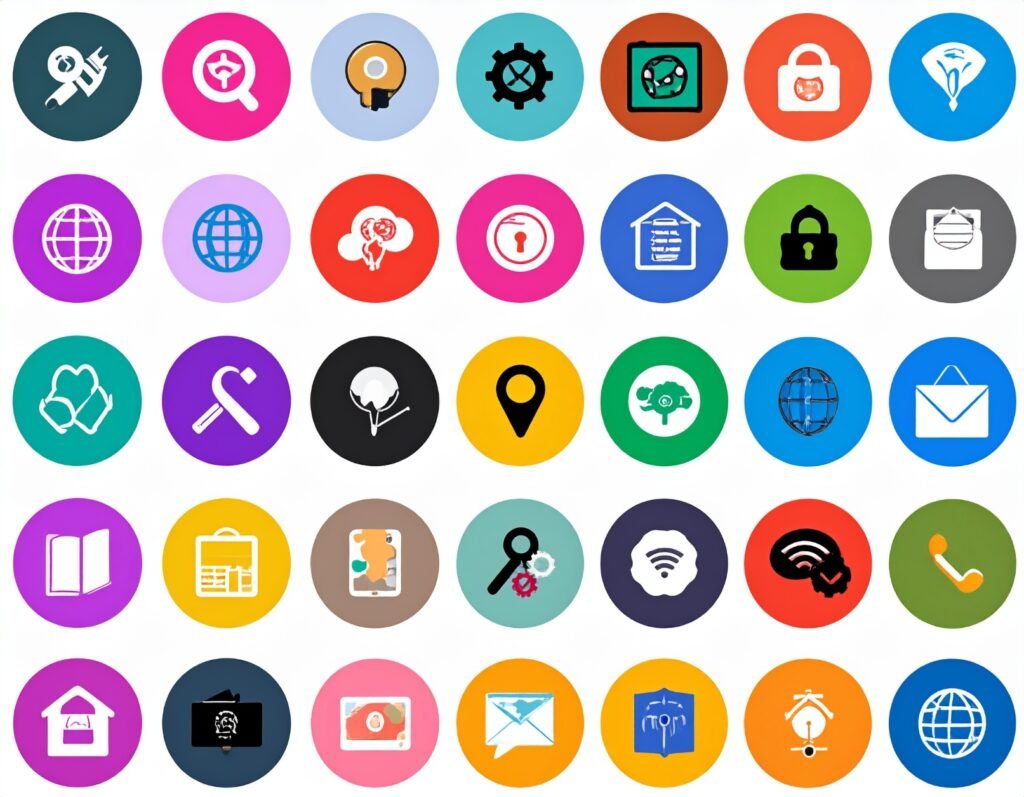
Icons are everywhere: from the magnifying glass that signals search, to the heart that saves favorites, to the familiar shopping cart. They are compact visuals that compress meaning into a glance.
Why designers love icons:
Speed of recognition: The human brain processes images tens of thousands of times faster than text. As Susan Weinschenk explains in 100 Things Every Designer Needs to Know About People, visuals are our brain’s preferred entry point.
Space efficiency: Especially on small screens, icons let designers fit more functionality without overwhelming the interface—a critical advantage in mobile-first design.
Universal potential: An envelope represents email across cultures. A play triangle signals “start” anywhere in the world.
Brand personality: Slack’s playful icons feel fun, while Apple’s geometric SF Symbols radiate precision.
But icons also stumble:
Ambiguity: A heart might mean “like,” “love,” or “save.” A star could be “bookmark” or “rating.” Without context, users guess.
Cultural pitfalls: A checkmark means success in the U.S. but can mean “wrong” in Japan.
Accessibility issues: Screen readers struggle with unlabeled icons, and complex visuals can be hard for low-vision users—reinforcing the importance of web accessibility.
As Alan Cooper points out in About Face, consistency and clarity build trust. Icons that change meaning across contexts do the opposite.
Text: The Anchor of Clarity
Text is explicit. It names things directly. A button that says Checkout leaves no room for doubt.
Strengths of text:
Clarity first: Users don’t hesitate when the label tells them exactly what’s behind the click.
Accessibility: Text works well with assistive technologies like screen readers and dyslexia tools—reinforcing inclusive web design practices.
SEO benefits: Words can be indexed, discovered, and ranked—icons can’t.
Consistency across cultures: Unlike gestures or metaphors, words can be precisely translated.
Challenges of text:
Takes up space: On small mobile screens, long labels can crowd the layout.
Overload risk: Dense text navigation feels heavy compared to the elegance of a clean row of icons.
Language barriers: Even translations can create clutter when space is tight.
As Steve Krug famously argued in Don’t Make Me Think, users shouldn’t have to puzzle things out. But that doesn’t mean text alone is always the answer—it’s about balance, supported by thoughtful UX strategy and web development.
When Icons Fail (and What We Learned)
The history of digital design is full of lessons from icon misuse:
Snapchat’s early days: Relying almost entirely on icons, the app left many new users baffled. They didn’t know how to add friends or view stories until explanatory labels were added.
Hamburger menu confusion: Once trendy, the three stacked lines proved too subtle. Older or less tech-savvy users often missed it entirely. Many apps now pair it with a Menu label.
The “history” clock icon: A Nielsen Norman Group study found that users didn’t recognize a clock as “browsing history.” None clicked it.
The takeaway? An icon without shared meaning is just decoration—a principle echoed in navigation best practices.
When Text Struggles
Text isn’t perfect either:
Mobile overload: Try cramming every e-commerce category name onto a phone screen—it quickly becomes a wall of words, which is why e-commerce design relies on smart iconography.
Translation challenges: Global apps like Airbnb found that text-heavy menus created problems across languages, while carefully chosen icons communicated universally.
Text guarantees clarity, but not always efficiency.
The Hybrid Approach: Why Icons + Text Win
Most successful digital products land somewhere in the middle. They use icons for speed, text for clarity, and combine both for reliability.
Instagram: The heart icon comes with a “Notifications” label. The once-confusing compass icon for “Explore” is now paired with text.
Apple iOS: Even with its minimalist aesthetic, the dock pairs icons with labels—Phone, Messages, Safari.
Government websites: Usability.gov uses icons with text on mobile, ensuring clarity where it matters most.
Steven Hoober sums it up well in Designing Mobile Interfaces: “Labels are not a crutch—they are a bridge.” This philosophy aligns with design systems thinking—consistency fuels usability.
Design Principles for Choosing Icons, Text, or Both
Know your audience
Younger, tech-savvy users may recognize icons faster.
Older or less digital-native users rely more on text.
Consider context
E-commerce: Pair a shopping cart icon with “Cart.”
News sites: Stick to text for categories like “Politics” or “Health.”
Respect screen size
On mobile, icons save space.
On desktop, text is practical and visible.
Accessibility always
Provide alt text and tooltips to ensure accessible design.
Ensure color contrast and readability with solid color design choices.
Think globally
Test icons with international audiences.
Avoid culture-specific metaphors (like owls for wisdom or thumbs-up for approval).
The Psychology of Icons in Interaction
Icons aren’t just functional—they influence how people feel.
Emotional design: Norman emphasizes that delight matters. Animated icons (like Twitter’s heart burst) create micro-moments of joy.
Cognitive load: Cooper warns that forcing users to guess meaning increases effort. Pairing text avoids this trap—a point central to UX research.
Typography matters too: As Ellen Lupton explains in Thinking with Type, the way you style labels—weight, size, spacing—affects scannability and trust, especially when part of cohesive typography systems.
Real-World Icon Narratives
Great icons don’t just work; they tell stories:
Slack: Friendly, rounded icons echo its playful, conversational tone.
Duolingo: Cartoonish icons make learning feel like a game.
Apple: Minimalist line icons match its brand promise of elegance and focus.
Icons, like typography, become part of the brand voice—a foundation of brand identity design.
The Future of Icons and Text
Design isn’t standing still. The next chapter of the icons vs. text debate is already unfolding:
Consistency systems: Google’s Material Icons and Apple’s SF Symbols provide predictability across apps.
Variable fonts: Responsive typography adapts to screen size, keeping text readable everywhere.
Micro-animations: Icons now pulse, spin, or pop to give feedback—a feature explored in interactive web design.
Voice hybrids: As Alexa, Siri, and Google Assistant grow, icons and text often act as silent cues in voice-first interfaces.
Tomorrow’s interfaces will blend words, symbols, and even voice seamlessly.
Final Word: Design That Doesn’t Make Users Think
So, which wins—icons or text? The truth is neither. The winner is the user.
The best interfaces combine the quick recognition of icons with the clarity of text. They respect context, accessibility, and culture. They are, above all, human-centered—designed not to impress other designers, but to help real people get things done.
As Krug would say: “Don’t make me think.” Whether you choose a word, a symbol, or both, the ultimate test is simple: can your user act without hesitation?
Takeaways for Designers
Pair icons with text for core navigation.
Use icons alone only for universally recognized actions (play, pause, search).
Use text alone for detail-heavy or descriptive options.
Always test with real users—an essential part of content and UX optimization.
If you strike the right balance, your design won’t just look polished—it will feel invisible. And that’s the mark of great web design.


